
Calculator
4.4star
630K reviews
1B+
Downloads

Everyone
info


About this app
Safety starts with understanding how developers collect and share your data. Data privacy and security practices may vary based on your use, region, and age. The developer provided this information and may update it over time.

No data shared with third parties
Learn more about how developers declare sharing

This app may collect these data types
Personal info, App activity and 2 others

Data is encrypted in transit

Data can’t be deleted

Independent security review
Ratings and reviews
4.4
611K reviews

Ryan Bonner
- Flag inappropriate
- Show review history
November 2, 2021
Finally! The layout is fixed! No more empty space. I love the new animations and how the scientific menu drops down and just squishes the other buttons so I can see everything at once. Although, I do wish it had conversions built in like, length, time, currency. And the background on the numbers, decimal, delete, and scientific menu arrow buttons are a little difficult to distinguish from the background of the app. I'm on Android 12 on a Pixel 4 XL.
40 people found this review helpful

Ember Zemian
- Flag inappropriate
October 21, 2021
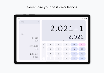
The best calculator app there ever was.... Was. It's very rare for a default app to be so perfect, but that's what the original calculator was. It was very simple, the controls are intuitive for editing and backspacing, and the button layout would make sense, perhaps more importantly your last answer result would always show back up when you re open the calculator. Good for on the go math. This last update has not only redesigned the cosmetic aspect, but it is too different. Revert please!
171 people found this review helpful

Anthony M
- Flag inappropriate
- Show review history
October 21, 2021
It's one thing to redesign the buttons and colors and stuff, that's cool. Moving the buttons around and changing their functions? Not cool. The calculator is something people get used to using and quickly, so changing the layout was just an awful idea, Google. That's like changing someone's keyboard layout to QWERTZ without asking or telling them, somewhat subtle but also very annoying and disruptive. Honestly just put erase back in top right and the equal button under the 3 and I'll be happy.
111 people found this review helpful
What's new
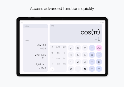
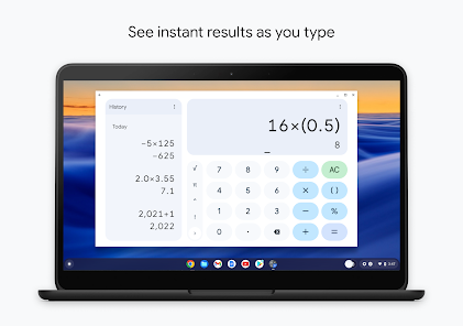
• Improved tablet support
• Quick settings tile support
• Bug fixes and performance improvements
• Quick settings tile support
• Bug fixes and performance improvements


